How does your media product represent particular social groups?
My magazine was aimed at teenagers and even young adults
aged around 16-21. However, my genre itself represents the social group “rock
lovers” who are people who actually enjoy listening to the genre. The social
group would typically be fans of “Halestorm”, “Muse” and “Foo Fighters.” My
magazine represents young people who are individuals that are unique and
confident. It would also focus on people who regularly attend gigs and
concerts. From the online polls and surveys I conducted, I gathered that the
features included on my media product are vital as it represents my target
audience.
I knew that my market research was vital to
follow because it had responses from my potential target audience. In order to
make my magazine successful, I followed these responses. From my market
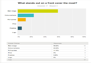
research results, I gathered that the main photo was what my target audience
thought was important on a front cover.
 |
| Results from SurveyMonkey |
This made me remember to have an effective front
cover image, which would relate to the particular social group I was aiming at.
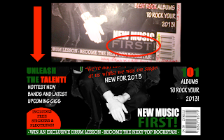
My front cover was a band so I had to make sure that the mise-en-scene of the
image was perfect. One of the band members had tattoos across his arm, which
gives off a “rebellion” feel to the magazine itself. The tattoos could
emphasize the music style that I am representing. I made sure that the tattoos
were visible on the front cover image and I aim my magazine to social groups
who enjoy loud sound. Additionally, by looking at different front covers from
my research I also realised that most magazines like “Kerrang” have band
members that wear quite a serious expression and each member’s pose is slightly
unique. This is a convention that I tried to carry out on my front cover as
well as I believe that the band members poses also act as a representative of
my chosen social group. On my front cover, I tried to get the band members to
look quite serious and I emphasised this by editing the main image to grey
scale.
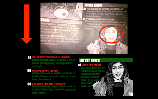
The articles I chose to feature on my contents page also
represent the social group I was aiming to represent. The articles are based on
popular rock bands that most “rock lovers” would look up to. Also, I made use
of casual language, which made my magazine overall seem more reader friendly
and less serious.
By creating online polls, it helped me know what features I
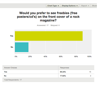
should include to speak out to my potential audience. For example, I asked on
my online poll “Would you prefer to see freebies on a front cover of a rock
magazine?”
The results show that most of my target audience preferred
freebies on a monthly rock magazine, which indicates that freebies on a front
cover were vital. This made me create features like “FREE CD”, “INCLUDES FREE
PLECTRUMS” and “WIN AN EXCLUSIVE DRUM LESSON.” Features like these represent my
chosen social group, as most young people would love to win free stuff that
relates to their favourite music genre.
Also, the information gained from my online polls and survey
helped me create my typical reader profile. The reader profile then helped me
maintain a clear idea of exactly the audience I was catering for and what
targets I needed to achieve to make sure my magazine was suitable for the
specific social group. When creating my magazine, I kept referring back to my
typical reader profile for inspiration.
 |
| Reader Profile |
My magazine can also represent my chosen social group simply
through the style of my magazine. The colour scheme is red, green, black and
white. I made sure to use red often throughout because of it’s connotations and
this can be easily associated with my target audience. Overall, I believe my media product does represent the
social group “rock lovers.” My research has helped me adapt my magazine to reach and represent the particular social group. My research featured responses by my target audience, which is important so I had to meet what most young people expected from a rock magazine.


